Responsive Enterprise Website
From lengthy forms to responsive tables, I've worked to make content-heavy websites easy to use by the actual people using them.

The Problem
Role
UX/UI Designer
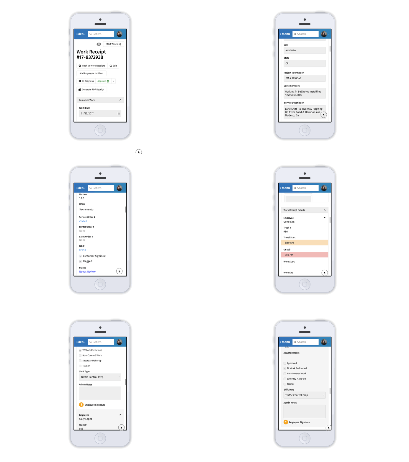
When I joined the team we discovered only .21% (not a typo) of users were using our ERP system on mobile devices even though it was being marketed as a fully responsive web app. After validating that users actually needed an app that worked on small screens, the design team pushed to make responsiveness a top priority.
Before Redesign: Unusable on Mobile
Responsive behavior problems created unusable forms and tables
Panels were overlapping, hiding content
Many table elements were not responsive at all

Process
I took inventory of the existing responsive problems and created design guidelines for developers following best practices in form, component and responsive design. I teamed up with the front end developer throughout the design process to ensure my designs were technically possible, sustainable and efficient.
Results
I delivered living documentation on mobile standards for the system and designed SM, MD and LG layouts. Working closely with the devs helped ensure we were on the same page and had the same goals. The new standards were implemented and we notified users of the enhancements. Small screen usage of the system is now up to 3.4% of daily active users and growing.

